
Wallpaper has a way of setting the emotional temperature of a room almost instantly. It brings colour, pattern, and a certain rhythm to the walls-sometimes quiet and tonal, sometimes bold and declarative. Curtains, then, are not just an afterthought. They are the response. The counterpoint. The element that either steadies the room or sends it into visual chaos.
Choosing curtains that truly complement your wallpaper isn’t about matching them perfectly. It’s about understanding how they speak to each other-how one softens, balances, or elevates the other.
Start With the Mood, Not the Motif
Before you look at swatches or fabrics, pause and read the room.
Is your wallpaper romantic, with trailing florals that feel almost like they’ve grown across the wall? Is it graphic and structured, with sharp lines and high contrast? Or is it barely there-a textured neutral that reveals itself slowly as the light shifts?
Curtains should echo this mood. A delicate, botanical wallpaper pairs beautifully with fabrics that move easily-soft linens, airy cottons, gentle sheers that catch light rather than block it. A bold, geometric wallpaper, on the other hand, often benefits from something more grounded: a structured fabric, a cleaner fall, a curtain that brings order to the visual energy on the walls.
When the mood aligns, the room feels cohesive without trying too hard.
Pull From the Palette-But With Restraint
Most wallpapers carry more than one colour. There’s the dominant tone-the one you notice first-and then the supporting hues that quietly hold the design together.
Your curtains don’t need to mirror the wallpaper exactly. In fact, doing so can feel overly coordinated, almost staged. Instead, choose a colour that exists within the wallpaper’s palette and let it take on a new role.
If your wallpaper blends muted greens with soft neutrals, you might choose curtains in a washed sage that deepens the tone slightly. If the wallpaper features a mix of warm blush and cream, a curtain in a gentle ivory can pull everything together without competing.
The idea is harmony, not duplication.
Know When to Step Back
If your wallpaper is bold-large-scale florals, intricate murals, strong contrast-your curtains should know when to be quiet.
This is where solid fabrics come into their own. They allow the wallpaper to remain the focal point while still contributing to the room’s overall composition. A well-chosen neutral can feel incredibly intentional, especially when it picks up an undertone from the wall.
On the other hand, if your wallpaper is subtle-think soft textures, faint patterns, or tonal washes-you have more freedom. Curtains can introduce a touch of contrast, a deeper colour, or even a gentle pattern, as long as it doesn’t disrupt the calm.
It’s a balance of presence and restraint.
Pattern With Pattern-Carefully Done
Mixing patterns is less about rules and more about rhythm.
If you choose to pair patterned curtains with wallpaper, the key is variation in scale and style. A large, sweeping wallpaper print can work beautifully with a smaller, more restrained pattern in the curtains. The two should feel like they belong to the same story, even if they don’t match.
Avoid pairing patterns that are too similar in scale or intensity-they tend to compete rather than complement. Instead, think of one as the lead and the other as the supporting act.
Often, though, the most elegant choice is to let one pattern speak while the other listens.
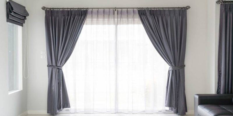
Fabric Changes Everything
Even in the same colour, different fabrics can shift the entire feel of a room.
A matte linen curtain will soften a space, lending it an easy, lived-in elegance. A subtle sheen-perhaps in a silk blend-can elevate the room, catching light in a way that feels more formal. Heavier fabrics add weight and structure, while lighter ones allow movement and air.
When working with wallpaper, fabric becomes a tool for balance. A visually busy wall might need the calm of a softer, more diffused textile. A quieter wall might benefit from the richness of something more substantial.
Texture, often overlooked, is what keeps a room from feeling flat.
Consider How Light Moves Through the Room
Wallpaper changes throughout the day as light shifts-and your curtains play a significant role in that transformation.
Sheer or semi-sheer fabrics will filter light gently, allowing the wallpaper to glow rather than sit flat. This works beautifully with softer patterns and lighter palettes, where the aim is to create a sense of air and openness.
Heavier curtains, by contrast, frame the wallpaper. They define its edges, creating contrast and grounding the space. In rooms with dramatic wallpaper, this can heighten the sense of depth and richness.
Think about when the room is used, how much natural light it receives, and what kind of atmosphere you want to create in those moments.
The Importance of Proportion
Even the most beautiful pairing can fall apart if the proportions aren’t right.
Curtains should feel generous. They should frame the window-and by extension, the wallpaper-rather than simply cover it. Hanging them higher and wider than the window allows the eye to travel, making the room feel taller and more expansive.
Fullness matters, too. Curtains that are too narrow look sparse, almost unfinished. A fuller curtain, with soft folds and movement, adds a sense of quiet luxury that enhances everything around it-including your wallpaper.
Where Custom Makes the Difference
This is where custom curtains quietly transform the outcome.
When you’re working with wallpaper-especially one with distinct tones or a strong personality-off-the-rack options often fall short. The colour is slightly off, the length not quite right, the fabric not in conversation with the rest of the room.
Customisation allows you to choose a fabric that truly complements your wallpaper, to adjust the length so it falls exactly as intended, and to create a finish that feels considered rather than convenient.
In spaces where every detail matters, that precision shows.
Edit, Then Edit Again
Once everything is in place, take a step back.
Does anything feel too loud? Too busy? Too carefully matched?
The most successful rooms often have a sense of ease to them, as though they came together naturally. Achieving that ease, however, usually involves a bit of editing-removing what doesn’t quite belong, refining what does.
Final Thought
Choosing custom curtains that complement your wallpaper is less about following rules and more about creating a relationship.
It’s about knowing when to echo and when to contrast, when to soften and when to define. When the balance is right, the room doesn’t feel decorated-it feels composed.
And in that composition, wallpaper and curtains stop being separate elements. They become part of the same story, told in light, fabric, and space.


Comments